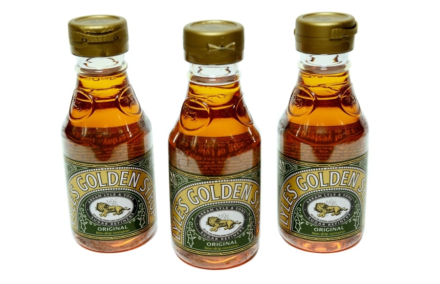
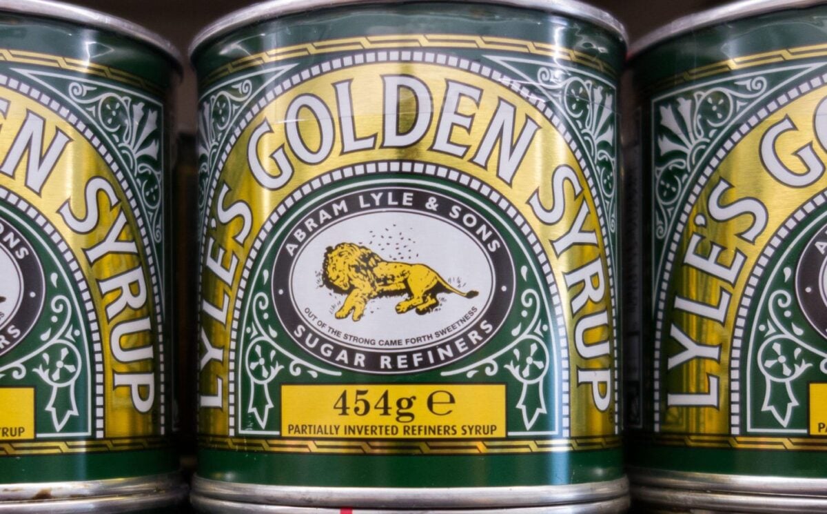
Tate & Lyle’s is dropping the image of a dead lion being swarmed by bees from some of its golden syrup packaging.
After more than 150 years, the iconic British brand is swapping its logo for a more modern design.
The dead lion logo was a reference to the Biblical story of Samson. In the Old Testament, he killed a lion and later noticed a swarm of bees had formed in the carcass.
On social media, some customers reacted with shock that the lion was there in the first place. “I’m today years old knowing Tate & Lyle had a dead Lion on the logo,” wrote one.
Tate & Lyle’s drops dead lion

The company has chosen to refresh its logo to appeal to modern shoppers. On some products, the new logo of the head of a happy-looking lion and a single bee will replace the dead lion.
“While we’ll continue to honour our original branding with the heritage tin, consumers need to see brands moving with the times and meeting their current needs,” James Whiteley, brand director for Lyle’s Golden Syrup, said, according to the Independent. “Our fresh, contemporary design brings Lyle’s into the modern day, appealing to the everyday British household while still feeling nostalgic and authentically Lyle’s.”
Tate & Lyle’s decision to update its brand image by removing a dead animal could indicate that compassionate values are becoming more widespread in modern society. Banal representation of animal cruelty could be seen as a reminder of humanity’s broken relationship with nature and animals. From I’m A Celebrity and the fashion industry to “speciesist” language and the food on our plates, casual animal abuse is commonplace in the UK.
According to the company’s website, all Tate & Lyle’s products are suitable for vegans, except its chocolate-flavored dessert syrup.


